Dina Karakosta — Senior Digital Product Designer, Utrecht. 7+ years across B2B SaaS and e-commerce, focused on design systems, interaction, accessibility, and AI-assisted workflows.
Ask AI about me
Drag to scrubFrame 01 / 48
CraftSystemsCode
Scroll
Work.
Case study 01
Rebuilding fifteen years of legacy at Mambu.
Leading product and design on the first full UI modernization of Mambu's core banking engine, migrating a legacy GWT front end to React and MUI under a strict no-workflow-change, no-backend-change, 100%-parity mandate.
Built and maintained an AI-readable design system in GitLab, plus two Claude Code skills that turn codebase context into Jira stories and automate accessibility and usability audits.
Rethinking permissions, actions and feedback in tables.
Designed a reusable table pattern that gives compliance officers clear, contextual feedforward on what they can and can't do before they act, closing 5 client tickets at Fenergo.
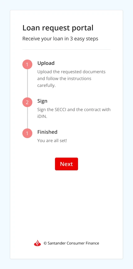
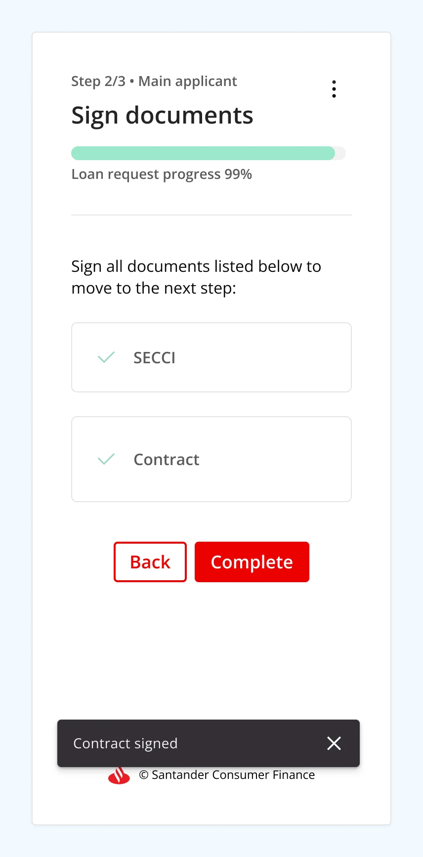
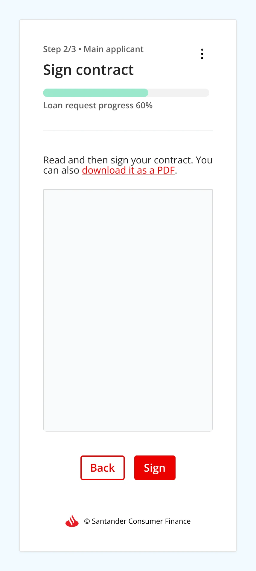
How extensive UX research uncovered why applicants were dropping out of a document upload and signing flow, leading to an end-to-end redesign that generated approximately €600K in additional monthly revenue from booked loans while reducing the manual work behind it.
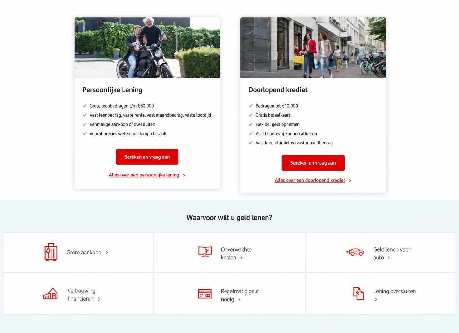
How driving user focus toward Santander's personal loans, in place of a lending product regulators were phasing out, led to a €7.5M annual boost in requested loan amounts.
Owning the end-to-end redesign of Mambu's core banking engine UI for a platform used by 200+ customers generating 1M+ daily interactions.
Ran 40+ moderated usability tests at every stage of the redesign, cutting usability issues by 56%
Built a new UI library with Claude Code hosted on GitLab, including Storybook docs, for company-wide adoption
Set up 2 custom AI workflows to mine requirements from the codebase and draft Jira stories, with roughly 90% of stories shipping first pass
Embedded WCAG 2.2 AA guidelines directly into components, documentation, and DESIGN.md files, giving engineers and AI agents clear accessibility guardrails
Apr 2023 — Apr 2025
Senior Product Designer, Fenergo
Led the end-to-end integration of the Sentinels Transaction Monitoring product into Fenergo's KYC/CLM platform, from discovery through delivery.
Owned the full design process behind integrating the Sentinels Transaction Monitoring product into Fenergo's KYC/CLM platform
Designed a new feedforward table pattern giving compliance officers clear warning before they acted, closing 5 big client tickets and becoming the reusable standard across every complex table in the product
Kickstarted a scalable design system initiative with engineering, fully documented in Storybook
Dec 2021 — Apr 2023
Product Designer, Sentinels
Improved the UX of the Sentinels platform, used by Anti-Financial Crime and Compliance teams to detect, monitor and report financial crime.
Led design and UX strategy across two agile squads building Sanctions Screening and Anti-Money Laundering workflows
Ran extensive usability testing to validate decisions for high-stakes compliance workflows
Contributed to a new UI component library, documented in Figma and Storybook for consistent implementation
Improved the UX of the company's website and digital environments across the Netherlands and Belgium.
Led UX research for a loan document-upload and e-signing flow, using data from a heuristics audit, Google Analytics, 400 Hotjar session recordings, and sales-agent interviews, then redesigned it end-to-end, recovering an estimated €600K in additional monthly revenue from booked loans
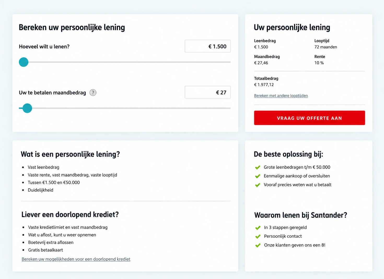
Ran two sequenced A/B tests reshaping the homepage around personal loans, contributing a €7.5M annual boost in requested loan amounts
Coded new UI elements in HTML & CSS to support rapid iteration; embedded user-centred thinking into cross-functional processes, lifting UX maturity org-wide
Foundations
UX Strategist, MediaMonks & early research
Started in research and strategy: as a UX Strategist at MediaMonks, and earlier as a research assistant at Utrecht University. It's the range that shapes how I approach new problems today.
Ran interviews, competitive research, usability testing and heuristic analysis for clients including Shell, Senseo and Heineken
Coded and analysed behavioural data for a psychology research project as a research assistant at Utrecht University
The tools behind my process.
Project management & tasks
Jira·Notion
Design ideation & prototyping
Figma·Figma Make·Claude Code
Design systems
Figma·Storybook·GitLab
Research synthesis
Miro·NotebookLM
Data
Google Analytics·Hotjar·FullStory
What people say.
Dina was always a Product designer, not just focusing on UI/UX design. Going much further to deeply understand the core user need and solution, with a consideration for constraints.
With Dina, this collaboration is always smooth and enjoyable. She is open to new ideas and consistently focused on improving design patterns and systems, ensuring the entire team benefits from her work.
One of the most thoughtful, strategic, and collaborative designers I've worked with. Any team would be incredibly lucky to have her.
She is all round product designer who will always put the work into it and explores multiple solutions. It has always been a pleasure to work with Dina — she is very respectful and passionate.
I have seen very few designers in my lifetime that are as thorough in delivering work as Dina — although she's a very mature designer, she's still eager to learn new things.
Rebuilding fifteen years of legacy without breaking a single workflow
Leading product and design on the first full UI modernization of Mambu's core banking engine, migrating a legacy GWT front end to React and MUI under a strict no-workflow-change, no-backend-change, 100%-parity mandate.
Company
Mambu (Core Banking SaaS)
Period
Aug 2025 — Present
Role
Senior UX Designer, Product & Design Lead
Impact
−56% usability issues
Context
Mambu's core banking engine platform ran on GWT, a front-end technology that predates most of the team currently building on top of it. The UI hadn't had a structural revamp in fifteen years, and by the time this project started it was carrying real usability, security, and performance debt. By then, 200+ customers were relying on the interface daily, generating 1M+ daily interactions on the platform, according to Grafana.
Leadership sponsored a full front-end modernization, and I led it end to end from a product and design perspective, the first person dedicated to owning that scope across the platform.
Research
Codebase requirement mining
Reading the GWT source directly to recover intent no one had written down.
Demo environment testing
Working through live flows to see actual behavior, not assumed behavior.
Customer focus groups
15+ calls surfacing pain points directly from daily use.
Usability testing
40+ sessions with internal and external users validating new patterns.
Engineering & PM validation
Checking every recovered requirement against the people who built it.
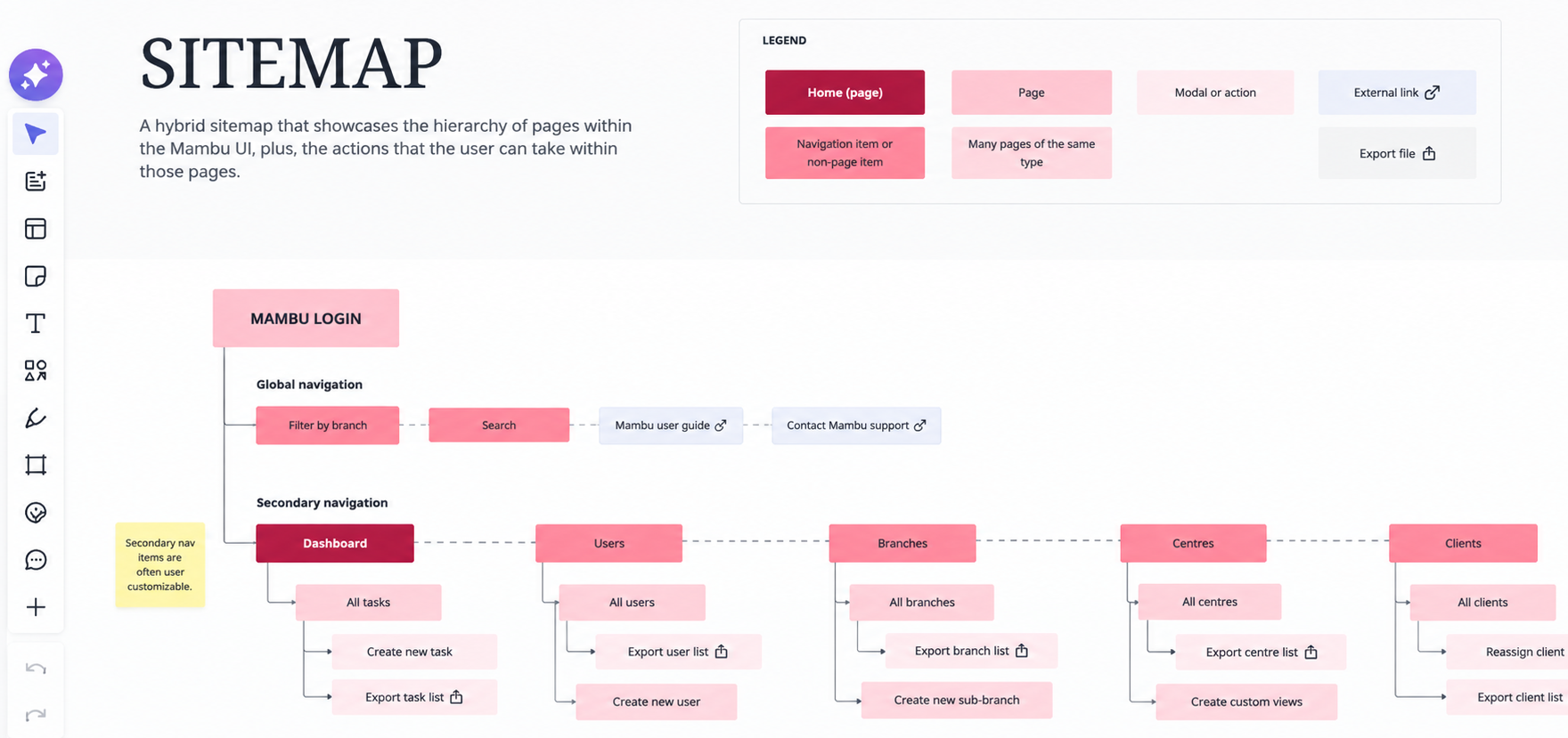
Sitemap analysis
I created a sitemap for the app so that I understand the information architecture of the app.
Part of the sitemap analysis
Approach
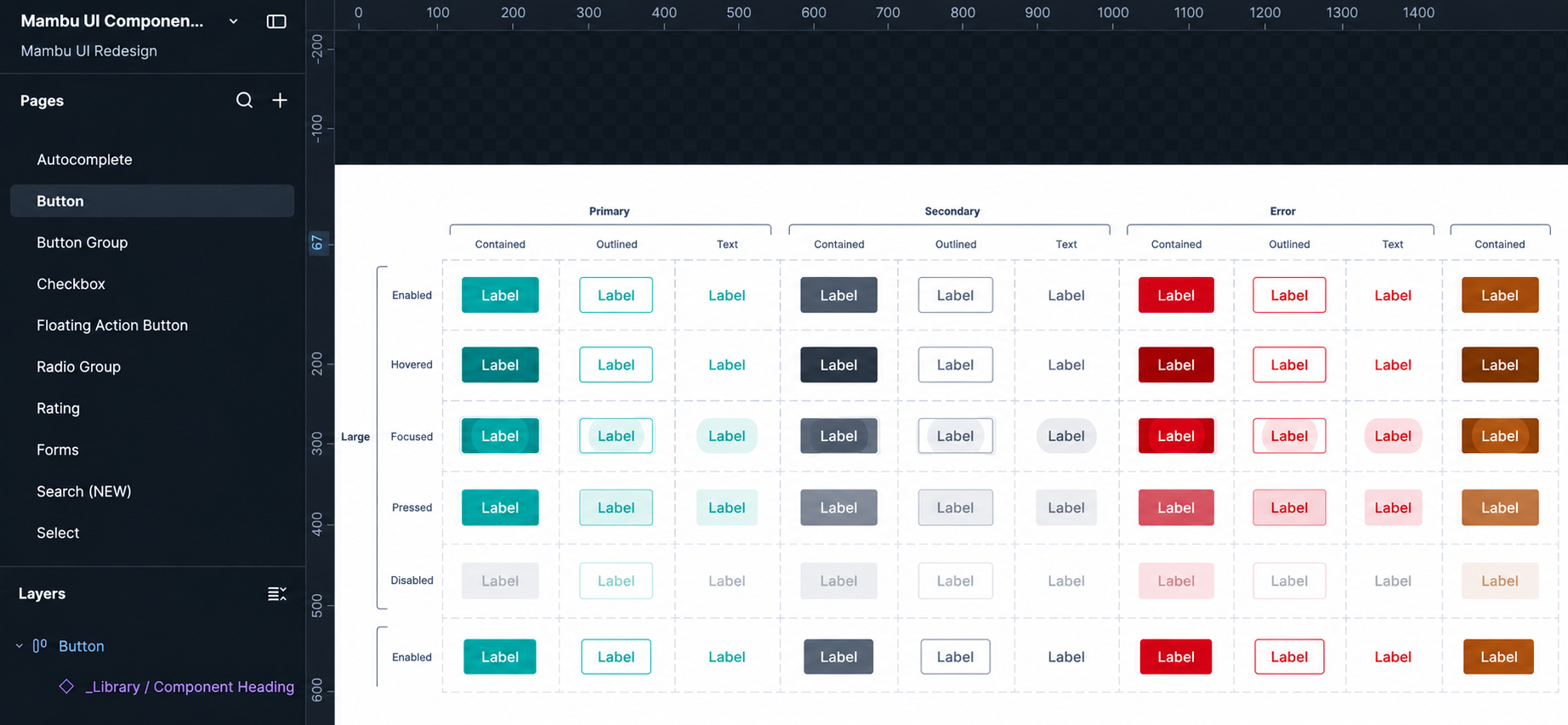
After workshops with engineering, I chose MUI as the foundational component library for its component richness, flexibility, and accessibility scaffolding built into its primitive components. I then built the Mambu theme on top of MUI in Figma, running colour-contrast and type-scale accessibility checks throughout.
Button component documentation in Figma
I translated recovered requirements into new patterns with as little added scope as the parity mandate allowed, working closely with engineers through refinement and feasibility sessions. I mapped every legacy pattern to exactly one new equivalent, ensuring 100% feature and data parity without re-solving the same problem screen by screen. I also addressed usability issues without changing existing user workflows, as required by the project's scope.
Together with the product manager, we created JIRA stories with requirements, acceptance criteria, and Figma links. Our team was AI-native: Claude and the engineers implemented each story, while the PM and I tested the results and filed bugs, creating a tight design–build–test feedback loop.
Before & after example
A note about the before/after examples
Mambu's production interface is proprietary, so the real screens can't be published here. What's embedded below is a faithful recreation built with Claude Code — same interaction pattern, same information architecture, placeholder data standing in for real customer records.
Before
One of the patterns this redesign replaced is a menu with dozens of unlabelled items and no way to search it.
Hover any top-level item in the interactive prototype below. The list underneath has no search, no grouping, and no internal scroll.
Finding one view means scanning the whole menu without any metadata help which increases time-to-find and cognitive load.
Before
After
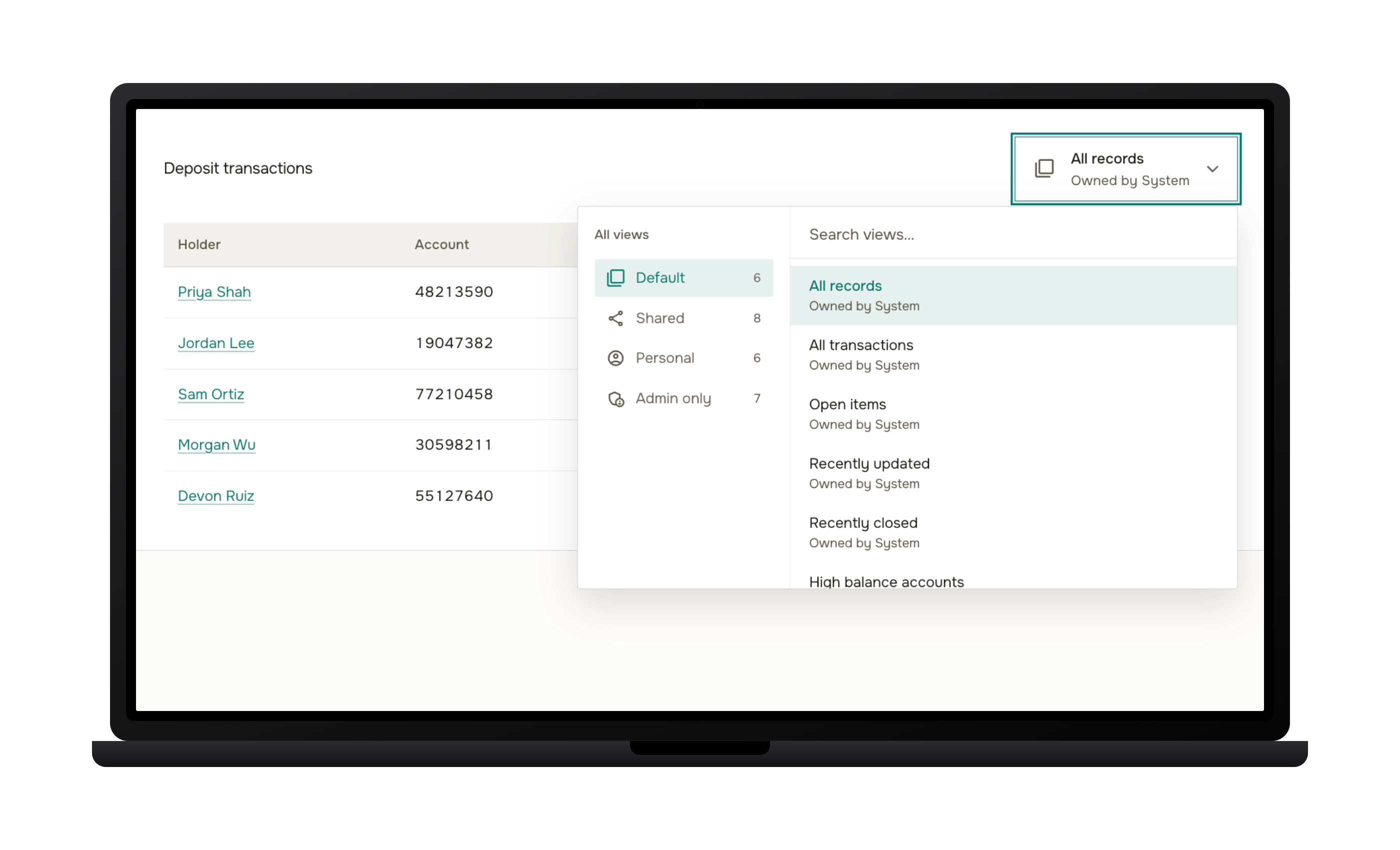
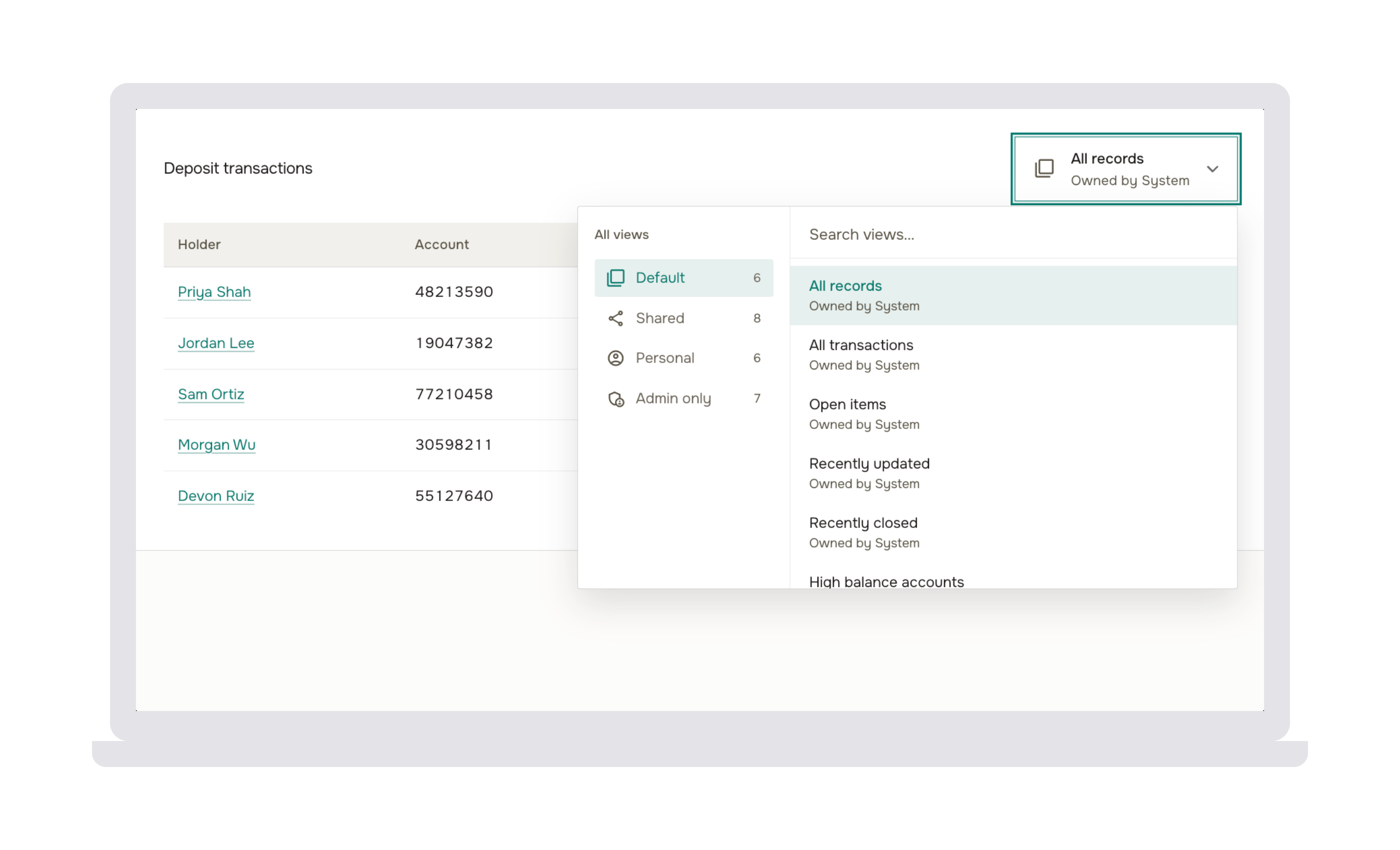
I redesigned table views as searchable, ownership and type aware view pickers.
I highlighted who owns each one, made them searchable by name, categorised them per type (Personal, Shared, etc.)
I contained everything in a menu that scrolls itself instead of the whole page.
After
Results & impact
Two independent comparisons, a WCAG 2.2 AA accessibility audit and a Nielsen Norman 10-heuristics usability review, were run against matched pages in both UIs to track the migration objectively rather than by feel.
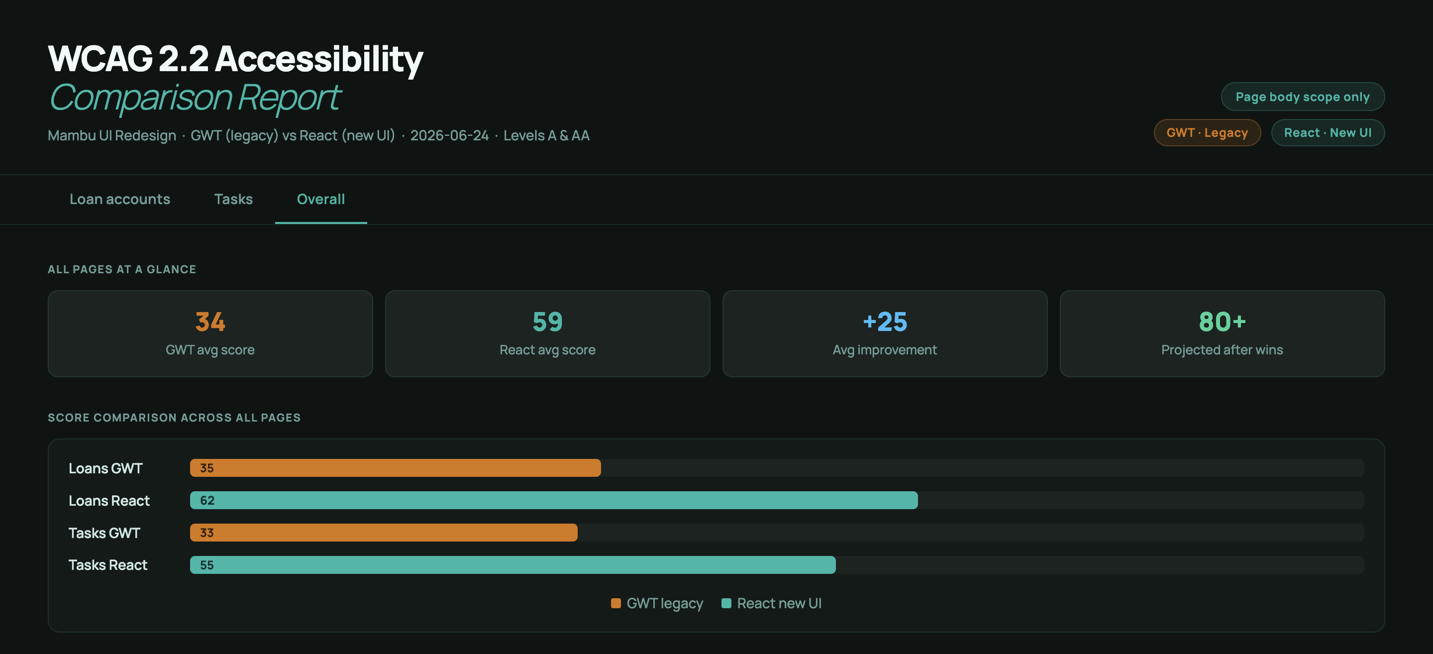
+25 pts
average WCAG 2.2 AA score gained across audited pages (34 → 59 / 100), with projected scores above 80 once the identified quick wins ship.
−56%
usability issues found in a Nielsen Norman heuristics review (61 → 27), with zero catastrophic issues remaining, down from two.
100%
feature and data parity held across roughly 100 feature toggles and their full permission logic, with zero workflow changes for any customer.
+288%
increase in positive usability findings recorded on the same pages (8 → 31), evidence the rebuild fixed root causes, not just symptoms.
Reflection
I've never worked on a project this constrained: every decision had to satisfy design, a fifteen-year-old backend, and a parity mandate that left almost no room to simplify.
What made it tractable was treating the audits as a compass rather than a scorecard: the accessibility and usability numbers above show a foundational rebuild, not a finished one, and the issues remaining in the new UI are refinement-level (missing ARIA labels, thin contrast margins), not the structural failures the legacy screens were full of.
Case Study 02
How I used AI in my product design workflow
Built and maintained an AI-readable design system in GitLab, plus two Claude Code skills that turn codebase context into Jira stories and automate accessibility and usability audits.
The Mambu UI modernization (covered in full in the companion case study) had no existing product spec for most of the app, roughly 100 feature toggles, and permission logic layered deep enough that it lived only inside the code itself. Working at the speed of AI meant the usual design-to-spec handoff was too slow to keep up, so I picked up a good part of the product-owner-style work myself: mining requirements, writing the stories, and pushing them from Figma to Jira faster than that handoff would normally allow. The design system itself had to keep pace too, so alongside the story-writing I built and maintained an AI-readable design system to keep Figma and the component library in sync.
Approach
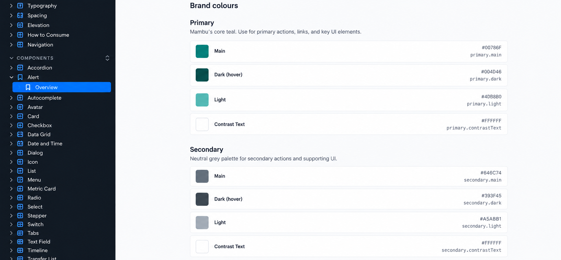
The Mambu Design System repository connects Mambu's design language to production code. It holds design tokens, themes, reusable UI components, Storybook docs, and dev tooling in one place, so design and engineering work from the same source.
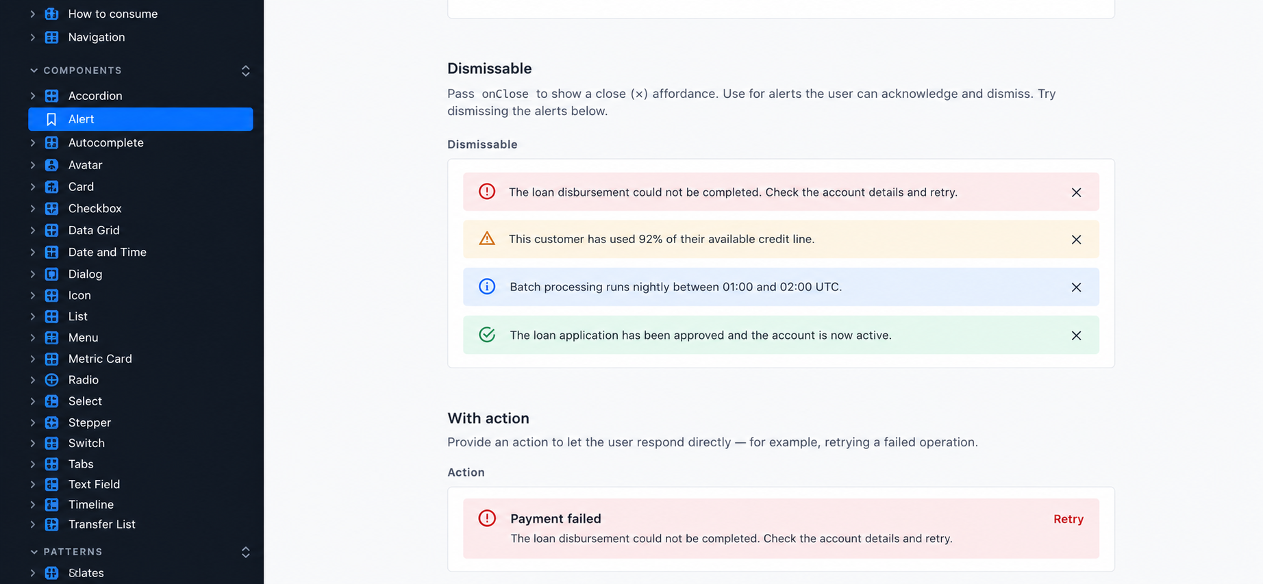
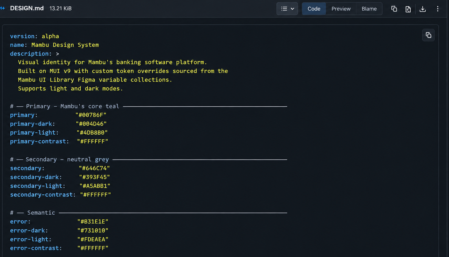
Image #1: brand colors and design tokens. Image #2: Alert component states and variants.
It starts with design tokens defined in Figma, including colors, typography, spacing, and other visual properties. These are translated into Mambu themes and reusable components built on MUI, so product teams can use established patterns instead of rebuilding UI from scratch.
The repository provides a component library, CLI, and Storybook, making components easy for engineers to adopt, explore, and test. Accessibility is built into the components from the start, following WCAG 2.2 principles, with automated Axe/Core testing in Storybook and CI to catch issues and prevent regressions.
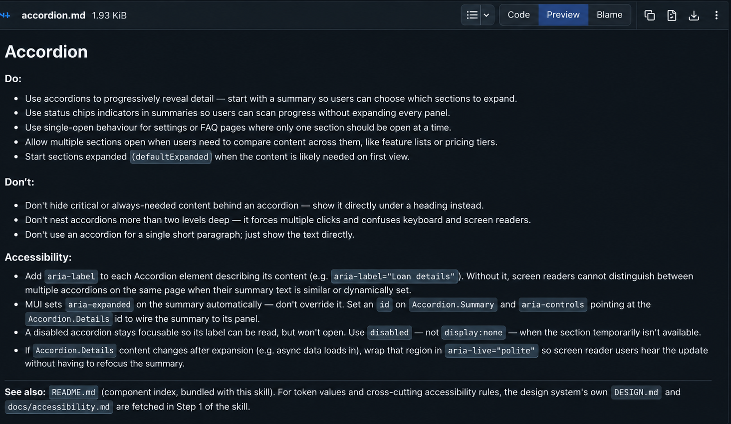
A key file is DESIGN.md, a machine-readable description of Mambu's visual identity alongside human-readable guidance. Combined with the prototype-with-mambu-design-system skill, which includes component-level Do/Don't, accessibility, layout, and responsiveness guidance, it gives AI coding agents a concrete design reference rather than relying on generic UI patterns.
The repository therefore becomes more than a component library. It acts as a shared source of truth for design, engineering, product, and AI.
I built a Claude Code skill that takes a section of the app as input and extracts everything that governs it: permission rules, feature toggle behavior, functional goals, and anything else a manual pass through the demo environment would likely miss.
From there, the workflow runs as a loop, not a handoff: I design against that extracted context, adding as little of my own interpretation as possible. The designs go back to Claude, which drafts a Jira story and holds a conversation with me to close any gaps, especially requirements I couldn't answer myself from the codebase alone. Once I approve the story, Claude posts it to Jira and messages the team on Slack that it's ready to pick up, or ready for refinement if open questions remain.
A second skill takes an app section and drives a Chrome extension through both the legacy GWT screen and its React rebuild, checking each against WCAG 2.2 AA. The output is a full comparison report: scores, severity-ranked issues, and a set of suggested remediation stories.
I review the suggestions, and approved ones get posted straight to the accessibility backlog in Jira. The reports this skill produces are the same ones behind the Results & Impact numbers in the redesign case study. A similar skill runs the same comparison for usability, scoring both UIs against the Nielsen Norman heuristics.
Generated through the skill, each grounded in requirements pulled directly from the codebase.
∼90%
Shipped first pass, with only 5 of those ∼40 coming back with open questions before engineering could start.
1 in 4
Stories needed no new Figma work at all, since existing designs or the component library already covered the pattern.
Reflection
AI-assisted development can drift from its own guardrails. Even with accessibility requirements in stories and the component library, Claude occasionally missed or hallucinated implementation details, creating issues after shipping.
Build for that drift, rather than assuming it won't happen. The audit skill acts as a compensating control, systematically catching regressions so they can be fixed like any other bug.
Case Study 03
Rethinking permissions, actions and feedback in tables
Designed a reusable table pattern that gives compliance officers clear, contextual feedforward on what they can and can't do before they act, closing 5 client tickets at Fenergo.
Company
Fenergo (FinTech)
Period
Feb — Jun 2024
Role
Product Design & UX Research
Impact
5 client tickets closed
Context
The Fenergo Transaction Monitoring app (formerly Sentinels) helps compliance teams at payment service providers, banks, and other financial institutions detect, monitor, and report financial crime such as money laundering and terrorism financing. Given the sensitive nature of the data and the critical responsibilities of its users, mistakes and inefficiency can have serious consequences: undetected financial crime, inaccurate reporting, or the company facing fines after an audit.
To manage that pressure and complexity, the product includes a strong permissions system controlling which actions different types of users can take and which information they can access. This project focused specifically on a new table pattern I designed to help users understand what actions they can or cannot perform within a table, and why, before they take that action.
Understanding the problem
Let's look at an example to better understand the problem.
One of the Anti-money Laundering Officer and Compliance Officer persona tasks is to assign work to themselves for the day.
A way that such types of users achieve this task is via a table that could be populated by hundreds or even thousands of items depending on the volume of transactions handled by the institution and some other factors. Each of the items of the table represent one alert to investigate and each alert has different stages.
There are 4 (validated) permissions related to assigning alerts to yourself as a user:
Permission #1
Anti-money Laundering Officers can only investigate the first 2 stages of the alerts
Permission #2
Compliance officers can strictly investigate the last stage of the alert when financial crime is much more possible
Permission #3
Anti-money Laundering Officer cannot investigate both of the first 2 stages of an alert because there is a standard maker-checker policy
Permission #4
Anti-money Laundering Officers and Compliance officers cannot work on alert if another team member is working on that alert at the moment.
Before the new solution was implemented, users received no clear feedback explaining why certain actions were unavailable based on their current selection of table items. The interface relied on either disabling buttons or having buttons appear and disappear dynamically. In some cases (such as permission #4), feedback was only provided after the user attempted an action, via a toast.
Research & design activities
Desk research
I conducted desk research such as exploring competitor and other apps to uncover how they deal with this kind of problem.
I've also researched the subject of disabled and hidden states, what are their pros and cons and how could this information help to pave the path towards the solution.
Validating assumptions
The following assumptions were validated by talking to subject matter experts and Customer Success team members and, going through JIRA tickets.
This problem frustrates the majority of users and obstructs their journey because they need to problem solve why they cannot perform an action.
Users need to know why they cannot perform an action as feedforward rather than feedback.
Ideation
I've had more than 5 concepts designed, prototyped and presented during design reviews before reaching the final solution.
Workshops
A series of workshops needed to be conducted to go through different concepts, assess their technological feasibility and estimate the size of the work. Members of the product, design and engineering teams participated in these workshops.
Usability testing
We tested the final concept with 8 users and refined it to the final solution according to the feedback gathered.
Design solutions
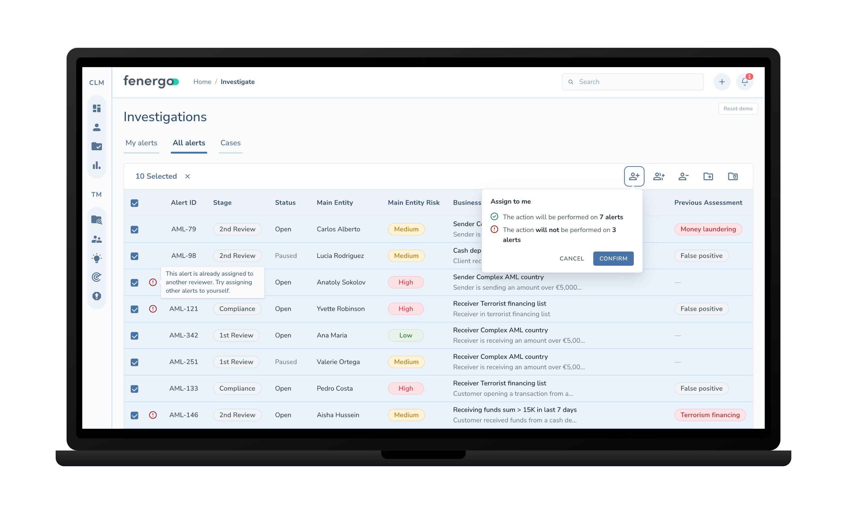
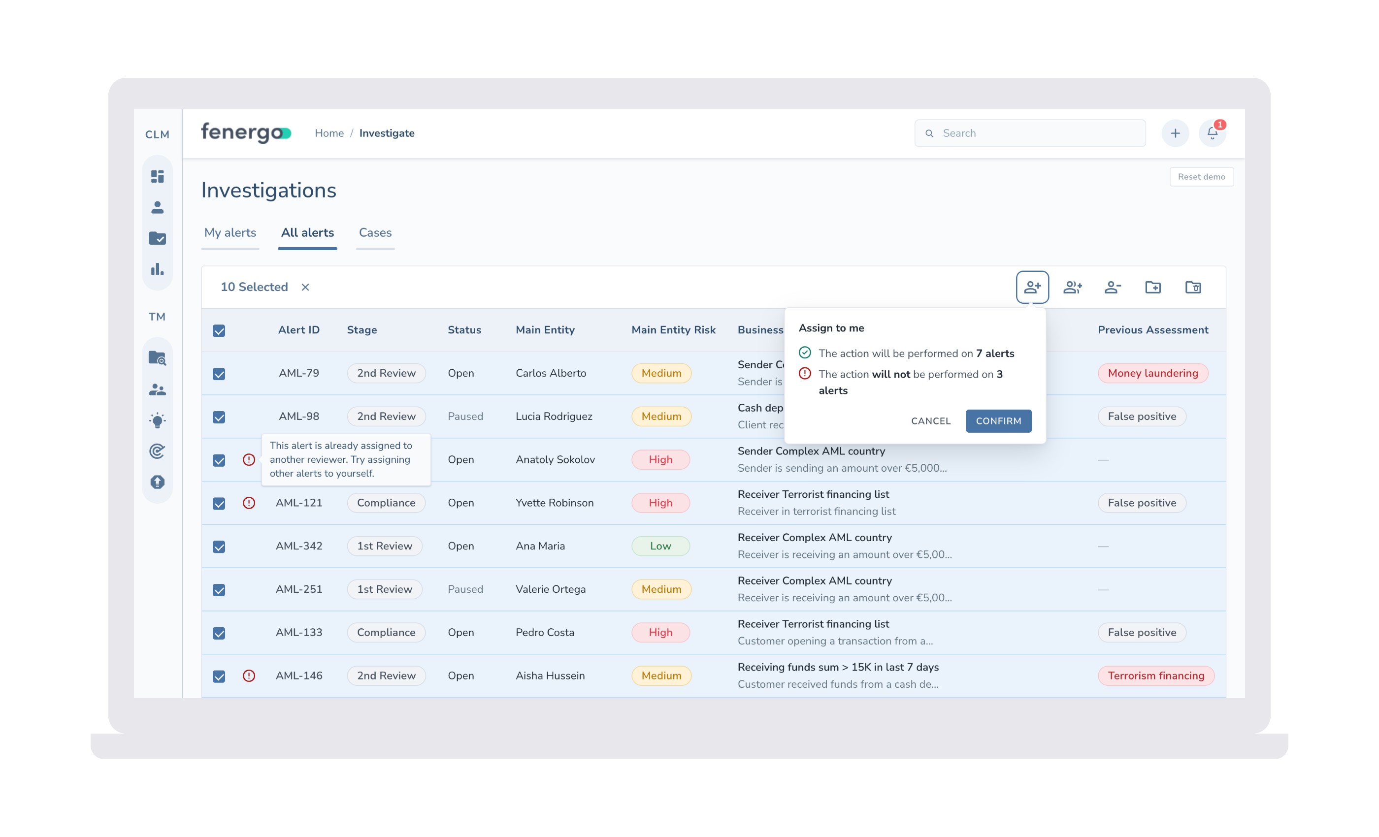
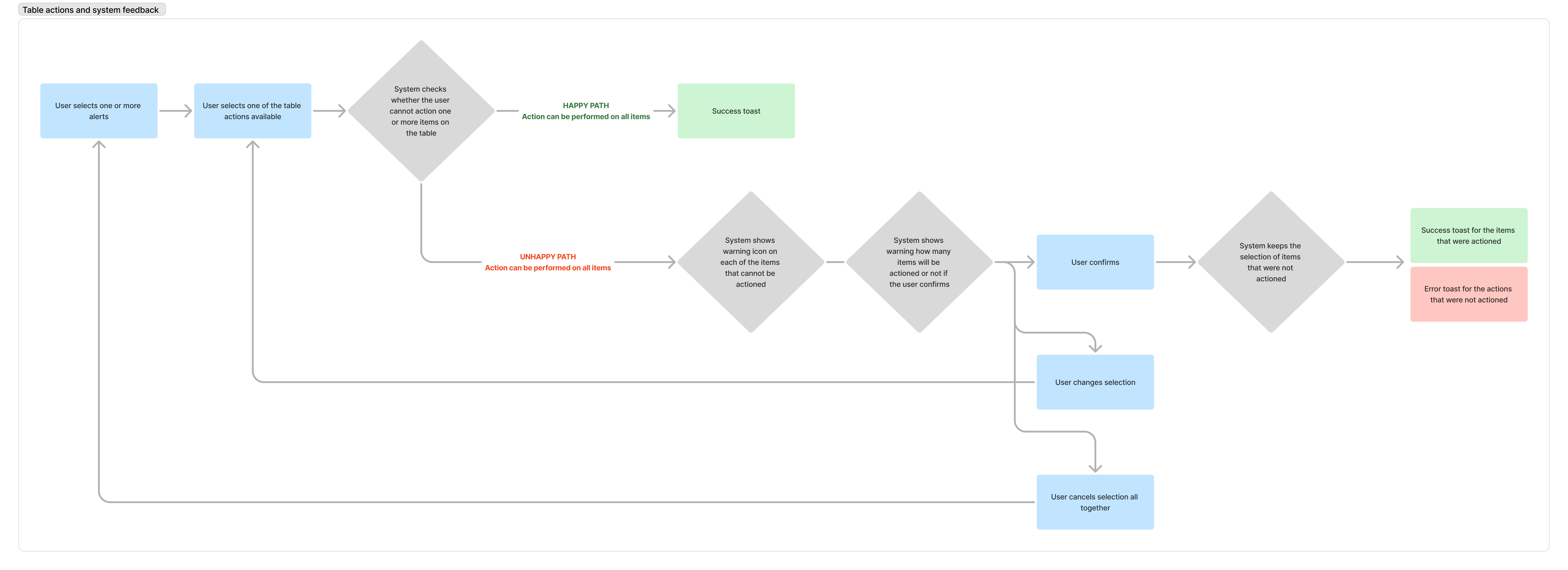
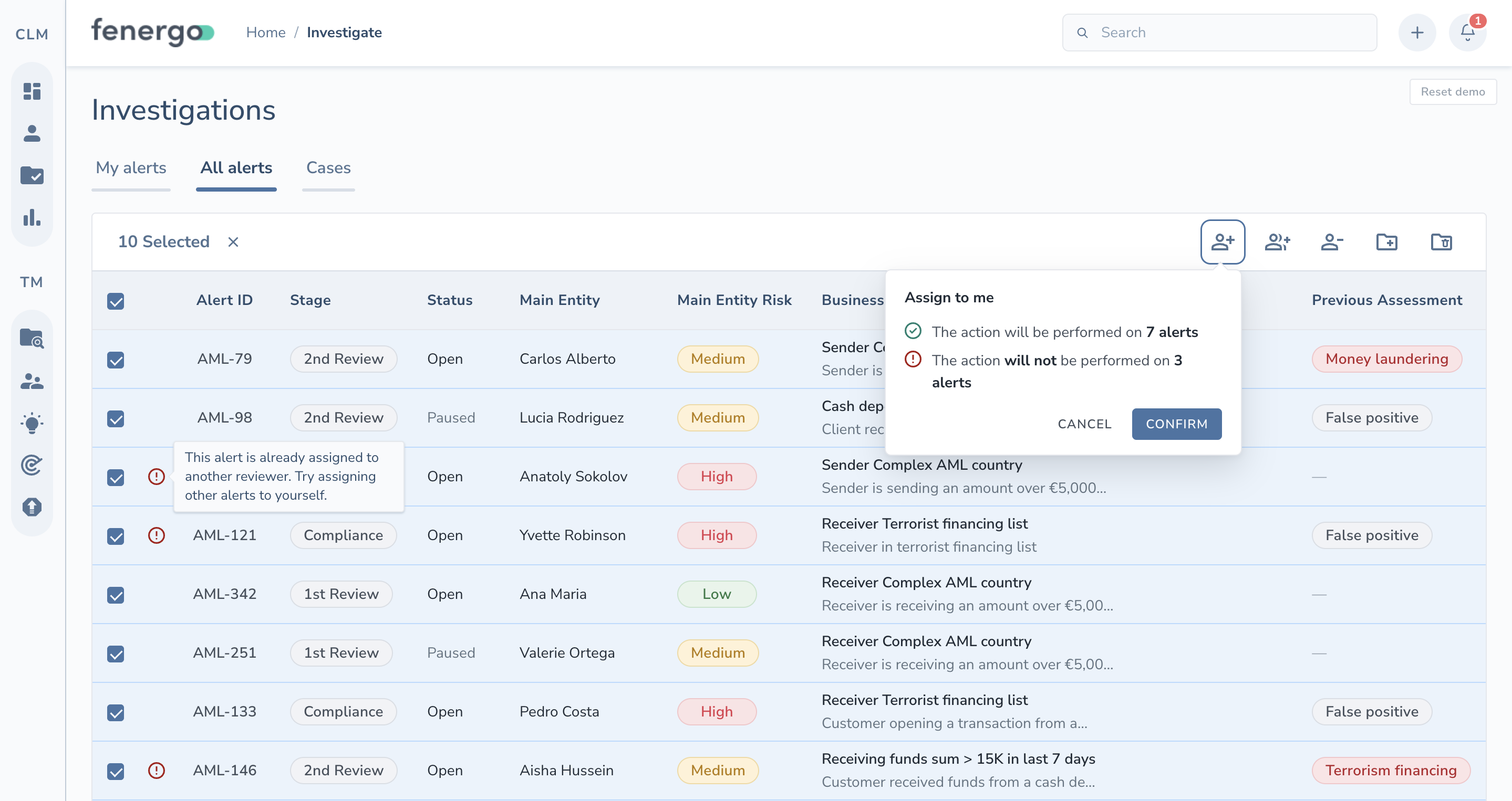
The unhappy path ensures users receive feedforward before confirming an action, helping prevent confusion or mistakes.
Mapping happy and unhappy paths.
To support this I added:
1
A new, narrow column in the table that displays warning icons next to any items that will not be affected by the selected action.
2
A tooltip that provides a clear explanation of why that item is non-actionable, when a user hovers over a warning icon.
3
A popover that shows an overview of what will happen if the user confirms.
Feedforward, before the click.
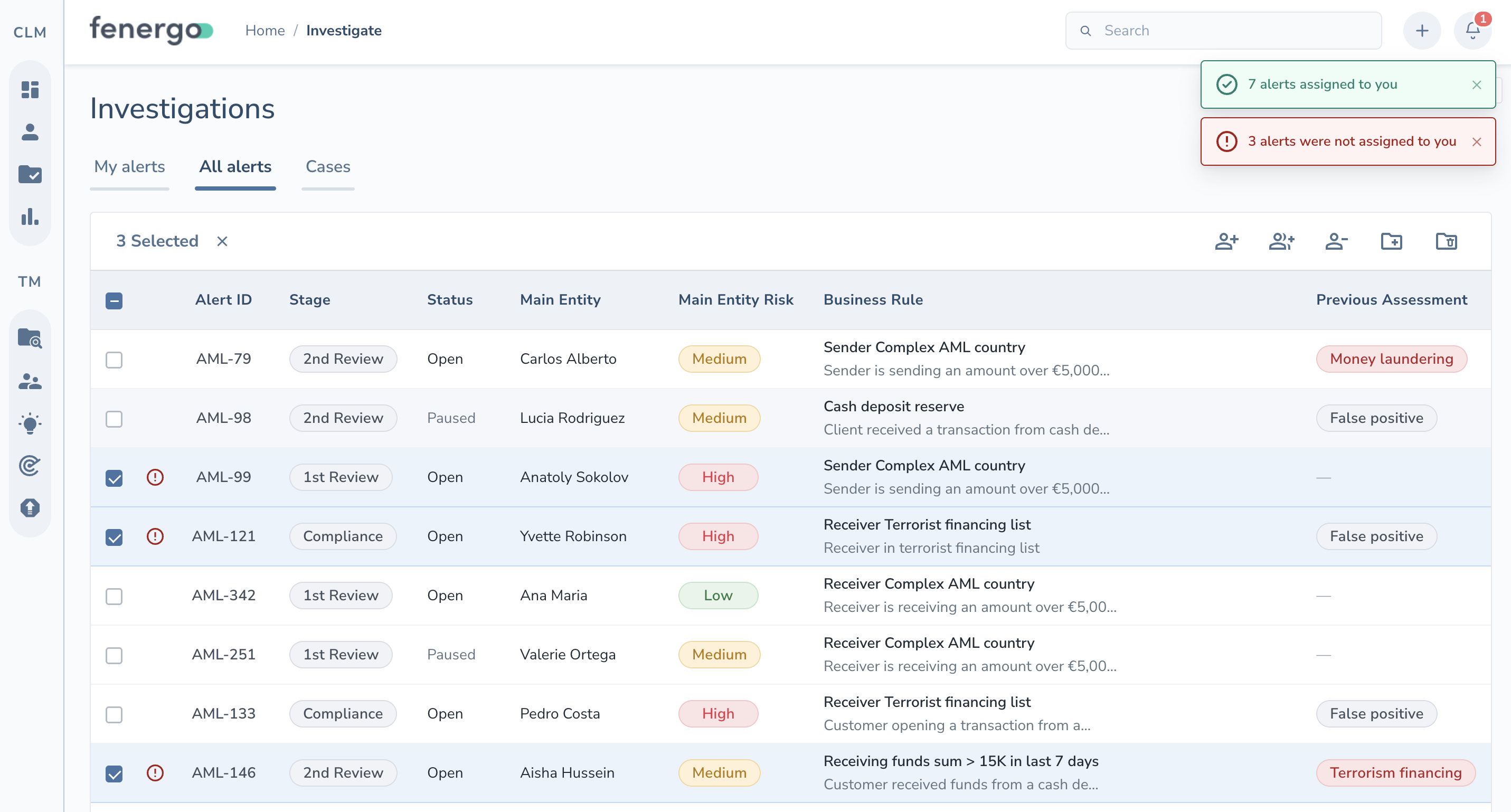
After the user confirms the action:
1
The table retains the selection of non-actionable items.
2
The system then provides feedback by showing success and error toasts, making the outcome immediately clear.
Feedback, after confirming.
Results & Impact
5 tickets
Closed by the Product and Client Services teams, opened by 5 different clients frustrated by the old pattern.
1 pattern
Reusable across every complex table in the product afterward, so the design team never had to solve this problem twice.
See the pattern in action.
Reflection
A warning icon, a tooltip and a confirmation popover weren't extraordinary elements on their own. What mattered was sequencing them so people understood the consequence of an action before committing to it, not after.
In a compliance tool where the underlying permission logic is genuinely hard to hold in your head, four overlapping rules stacked on role, stage, and a maker-checker policy, that shift from feedback to feedforward is what actually closed the support tickets.
Case Study 04
Reducing dropouts for Santander's loan portal
How extensive UX research uncovered why applicants were dropping out of a document upload and signing flow, leading to an end-to-end redesign that generated approximately €600K in additional monthly revenue from booked loans while reducing the manual work behind it.
Company
Santander Consumer Finance Benelux
Period
Aug — Nov 2021
Role
UX Research & Product Design
Impact
+€600K monthly revenue
Context
Santander Consumer Finance Benelux had already launched a Personal Loan request portal for document uploads and e-signing: a self-serve flow meant to make applying for a loan faster for the customer, and cheaper to operate for the business.
But conversion was underperforming. In lending, that isn't just a UX metric: every applicant who drops out mid-flow is a loan that doesn't get booked, interest income that doesn't materialize, and, if the friction is bad enough, trust in the brand that erodes. Significant resources had already gone into building and promoting the portal, so I was brought in to find out, from a UX perspective, exactly where and why people were leaving.
Research, problems & solutions
Research
I conducted a usability heuristics audit against the 10 Nielsen Norman usability principles.
I cross-referenced it with Google Analytics to pinpoint the steps where users dropped off the most.
I reviewed 400 Hotjar session recordings to watch behaviour first-hand.
I interviewed three Sales Agents who talk to applicants every day.
I validated early solutions with Figma prototypes with 4 end-users.
Problem
Applicants couldn't tell their documents apart
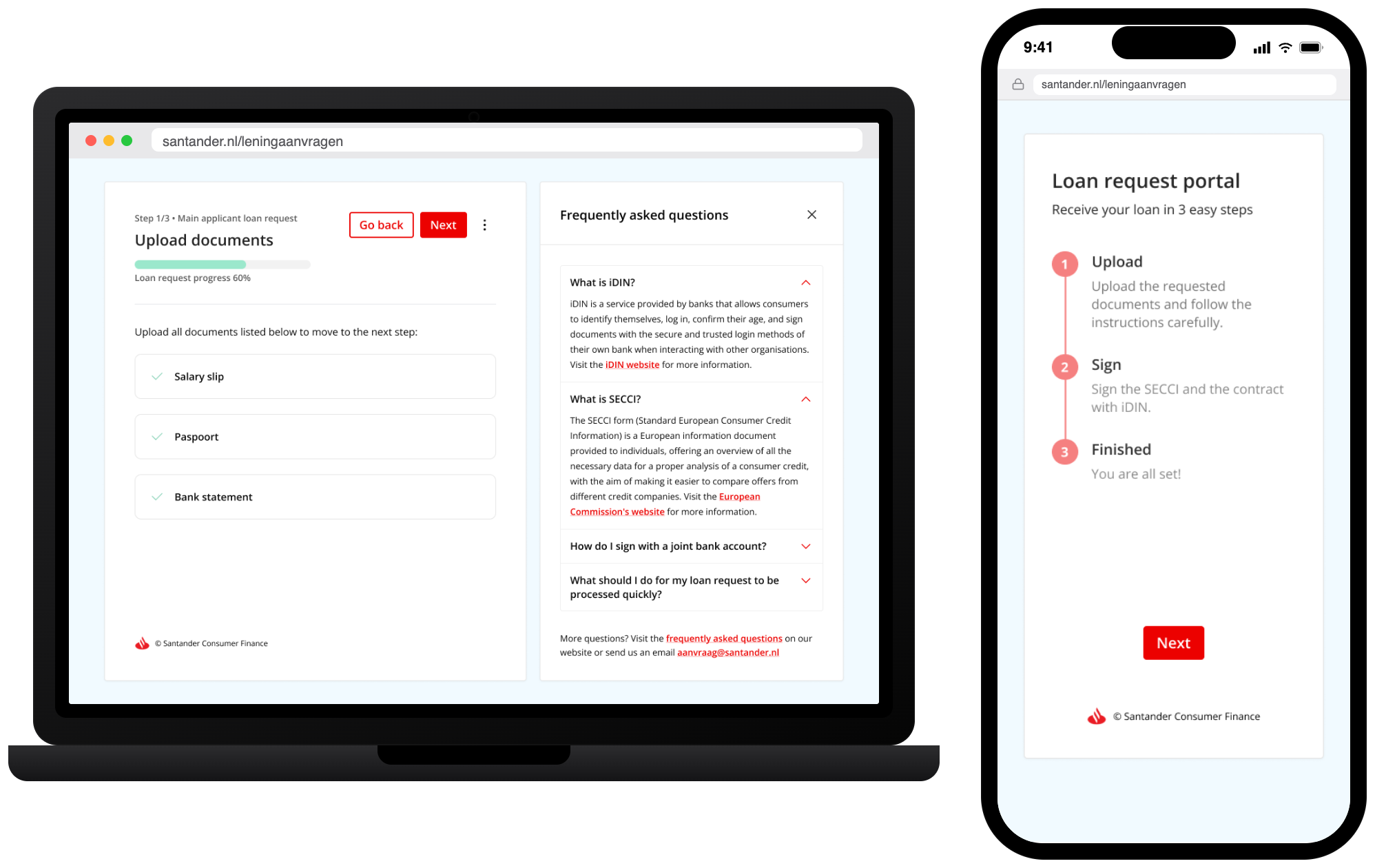
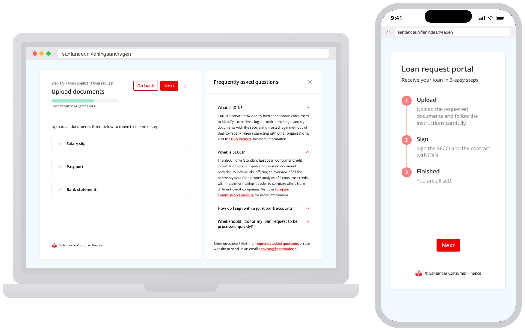
Hotjar recordings showed applicants repeatedly confusing which uploads belonged to them versus their partner. Sales agents confirmed it: both applicants landed on the same page, with upload elements mixed together and no way to tell them apart.
Solution
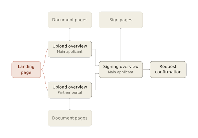
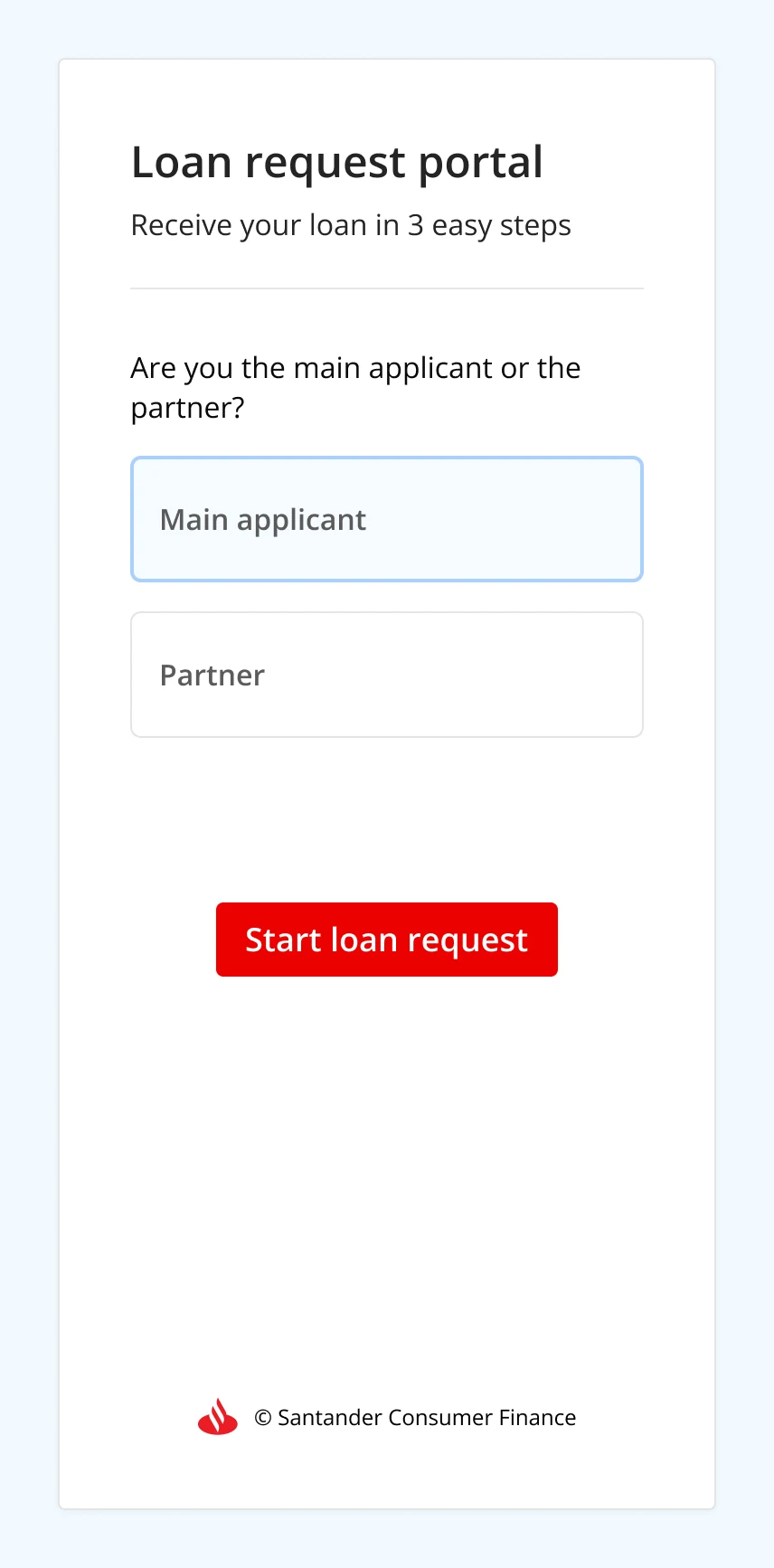
Ask up front: main applicant, or partner?
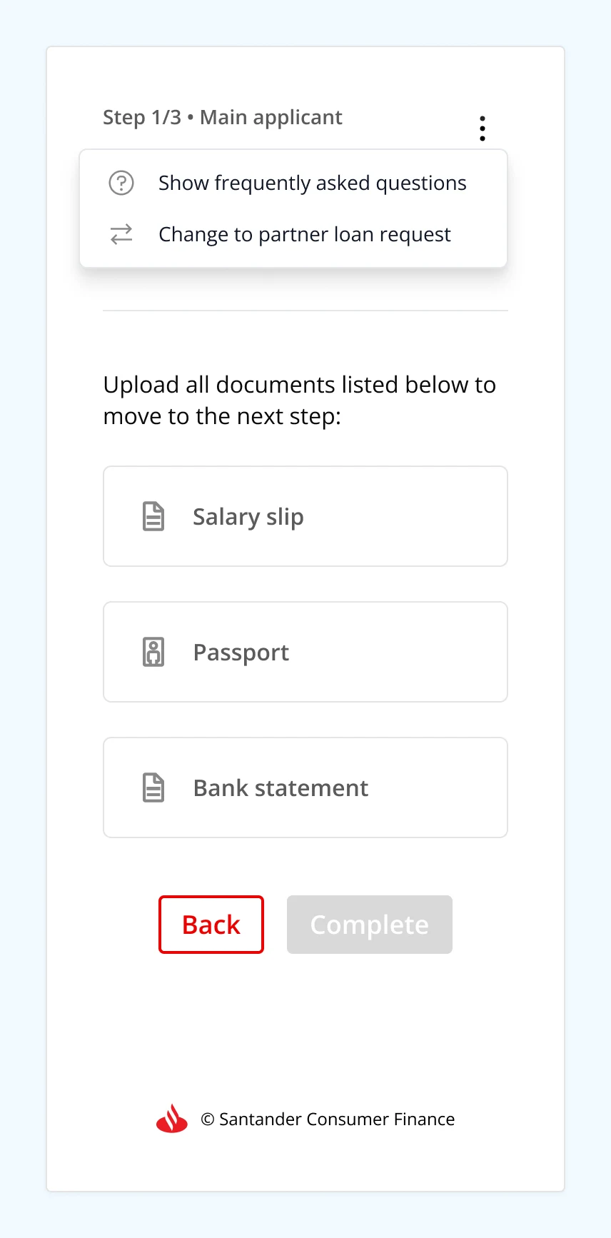
Users can switch views at any time, so each person only ever sees their own documents.
Problem
30% drop-off between instructions and upload
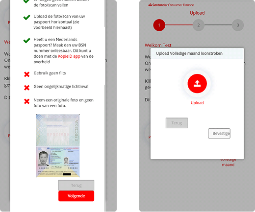
Google Analytics showed heavy back-and-forth navigation inside the upload modals, with a 30% drop-off between step 1 (instructions) and step 2 (the actual upload) in the Dutch ID dialog alone.
Solution
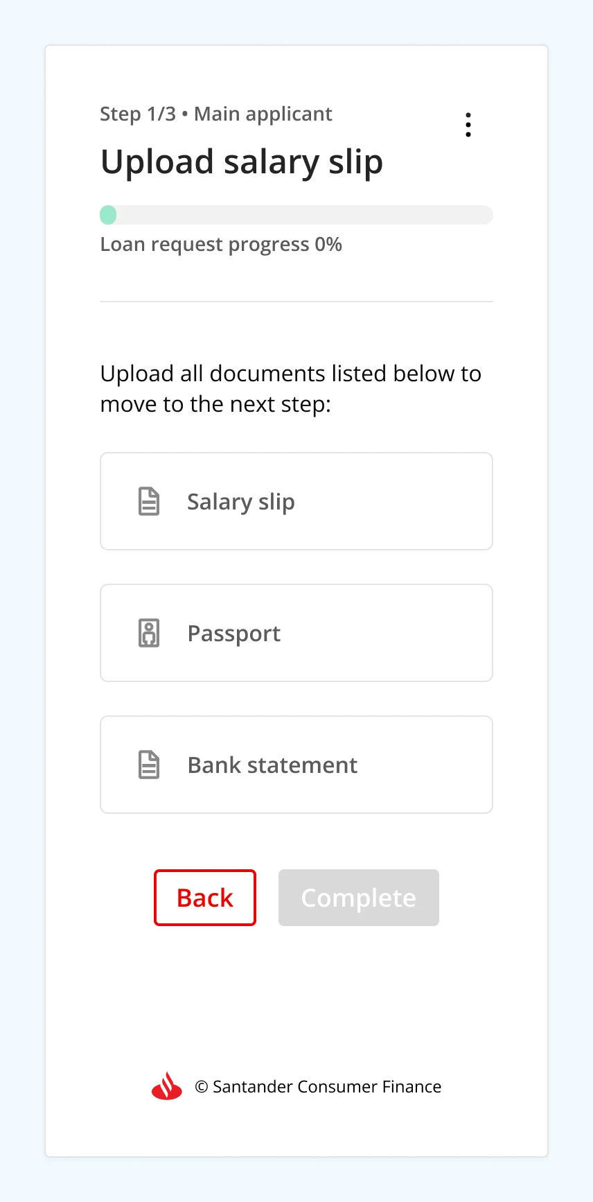
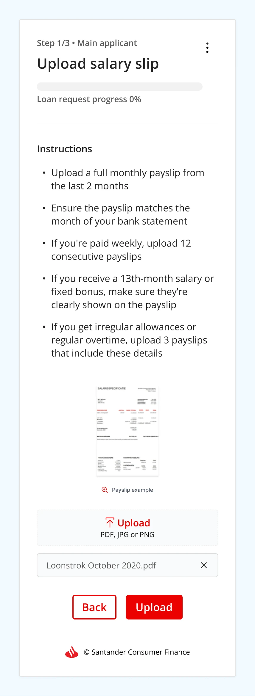
Consolidate uploads onto a single page
Clear visual hierarchy, plus a zoom feature so example document images are actually legible.
Original mobile modal: Dutch ID upload, steps 1 & 2.
Problem
Complex instructions generated phone calls, not clarity
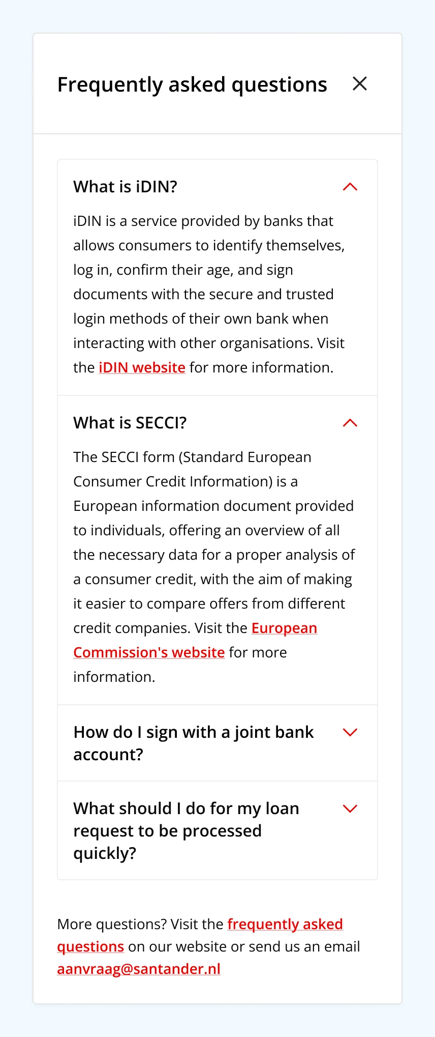
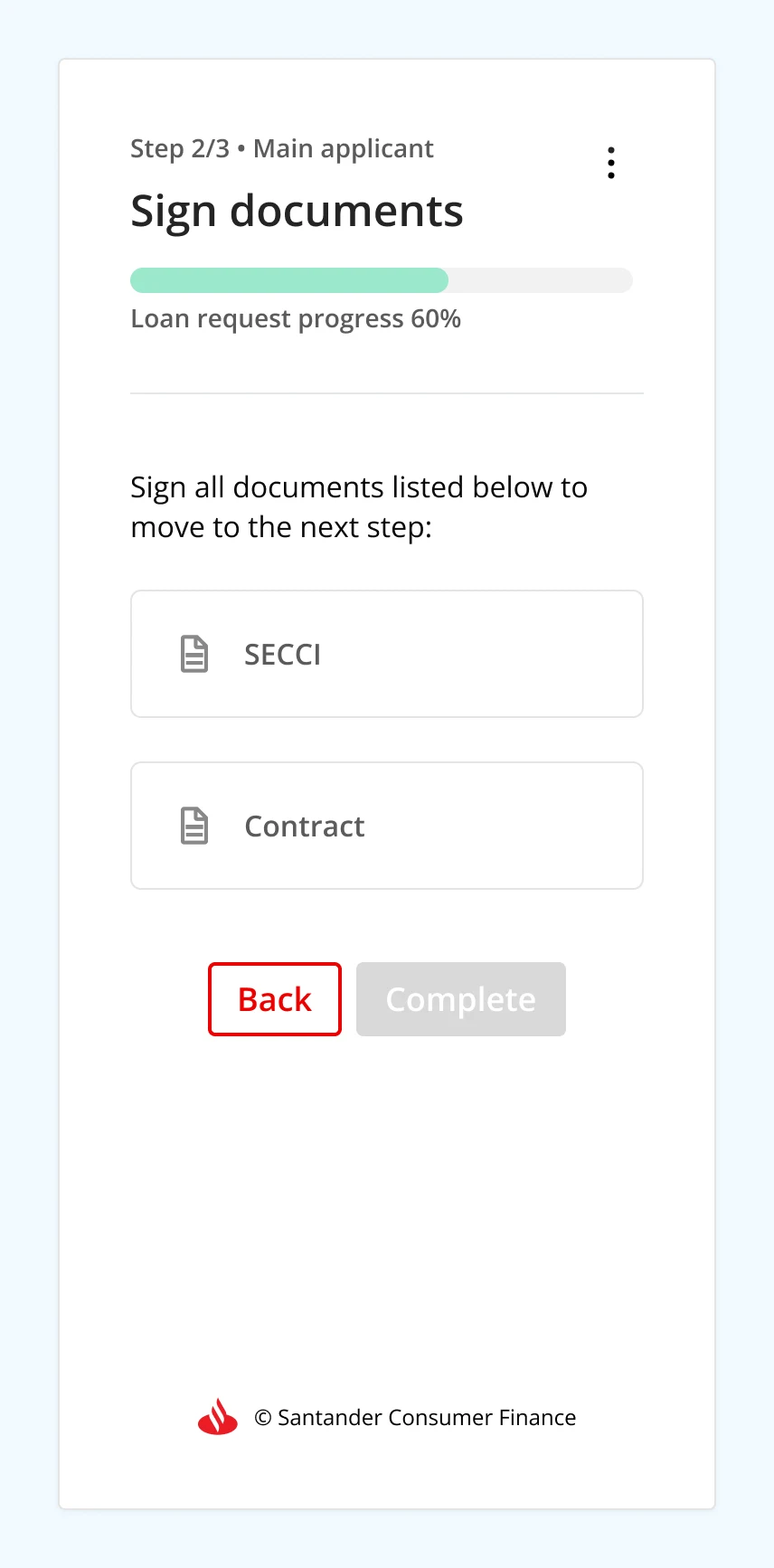
Sales agents reported frequent upload errors and repeat calls tracing back to overly complex portal instructions. Several applicants didn't understand what the SECCI document was for at all. Joint-account signing differences added another layer of confusion.
Solution
Rewrite instructions and add an FAQ
Rewrite signing and document instructions for clarity, developed jointly with legal and communications so accuracy wasn't traded for simplicity.
Add an FAQ section to absorb the most common questions before they became phone calls.
Problem
The interface gave people nothing to hold onto
Users repeatedly tapped example document images expecting a response. No progress indication, no upload feedback, and no help text on accepted file types or sizes.
Solution
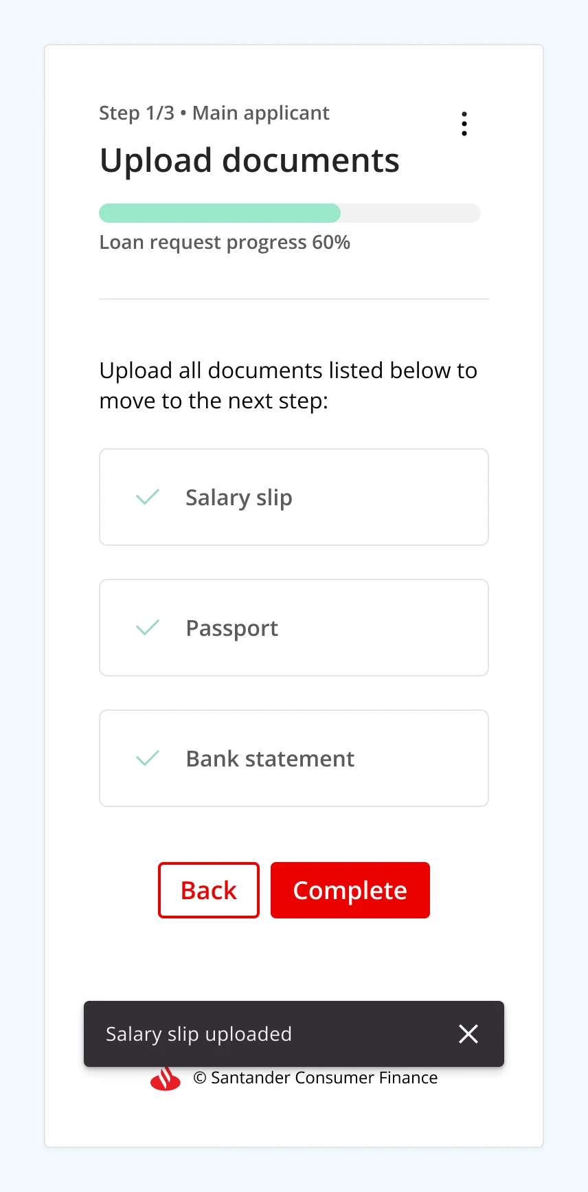
Add a progress indicator with contextual feedback
Microcopy and contextual feedback guiding people through each step instead of leaving them guessing.
Problem
The portal no longer looked like the brand
Visual and interaction design lacked consistency, the colour palette didn't match Santander Consumer Finance's current brand, and UI elements had no defined states.
Solution
Align with current Santander Consumer Finance branding
Closing the gap between the product and the brand it represents.
Mapping the new user flow.
Final designs
Scroll to see the full flow →
Results & impact
Four months after launch, operations agents tracked the monthly volume of incorrectly uploaded documents; working with the marketing team's analyst, we tied the redesign directly to conversion.
−8.9%
Decrease in incorrectly uploaded documents, a steady drop that meant operations agents had far fewer files to check manually.
+3.5%
Increase in conversion rate on the loan request flow, over the same four-month window as the drop in incorrect uploads.
~€600K
In additional monthly revenue from booked Personal Loans.
Reflection
No single source in this project would have been enough on its own: analytics showed where people dropped off but not why, Hotjar recordings showed confusion but not how often it led to abandonment, and sales agents had the pattern-recognition from hundreds of calls but no visibility into the data.
It was only by holding all five sources against each other that the real, fixable causes, not just symptoms, came into focus.
Case Study 05
Removing revolving credit to protect consumers
How driving user focus toward Santander's personal loans, in place of a lending product regulators were phasing out, led to a €7.5M annual boost in requested loan amounts.
Company
Santander Consumer Finance Benelux
Period
2020
Role
CRO & UX Research, Marketing Team
Impact
+€7.5M annual loan volume
Context
The VFN (Association of Financing Companies in the Netherlands) protects consumers against excessive lending and unnecessary financial risk. When it tightened its lending standards in 2020, during COVID, many banks, Santander Consumer Finance Benelux included, stopped offering revolving credit altogether.
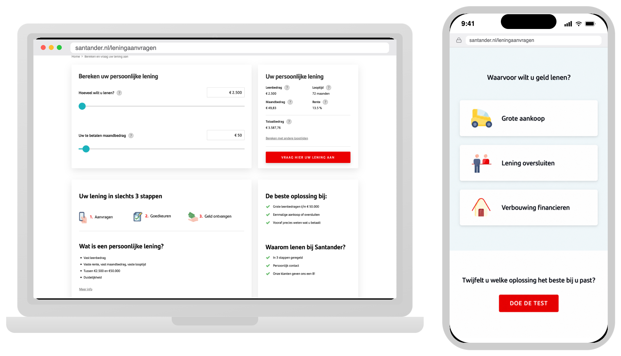
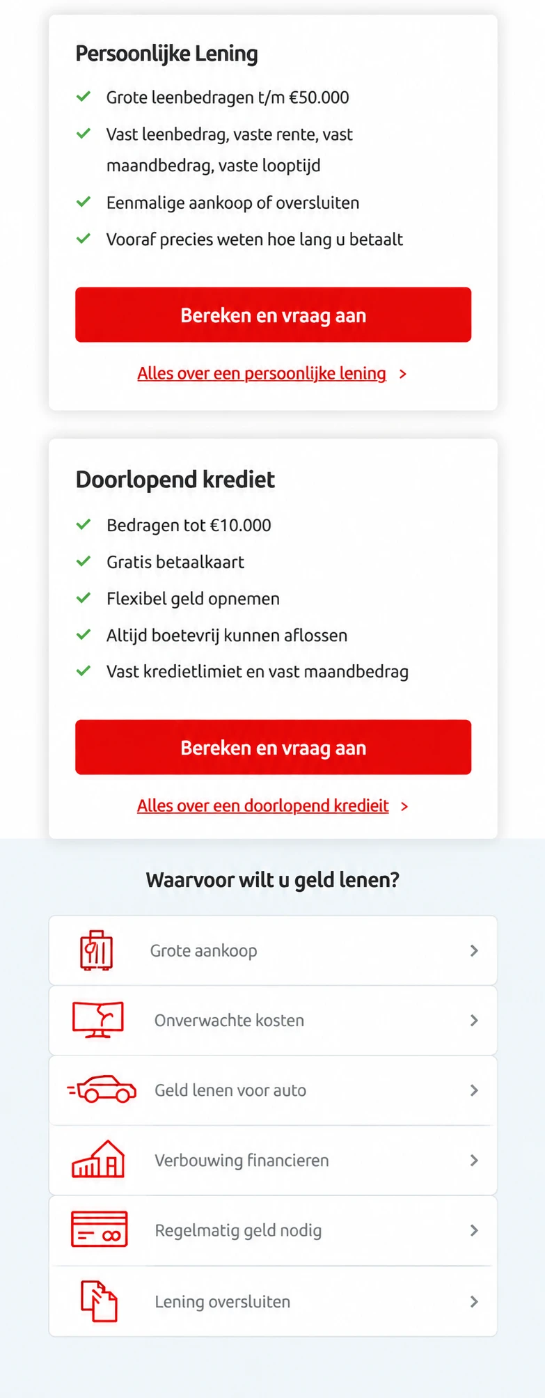
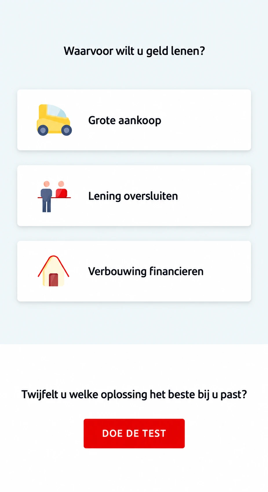
As part of the marketing team, I was asked to assess what pulling revolving credit off the website would mean, not just for the informational pages that had to come down, but for how the rest of the site steered people toward personal loans instead. Beyond removing those pages, we identified three areas that needed redesign and A/B testing: the product comparison cards, the loan purposes section, and the loan simulation page.
I ran a survey directly on the website, using the Hotjar Feedback Widget, to understand what actually drove the loan decision.
28% of participants mentioned the simple process as the most important factor while making their loan decision
22% of participants indicated their need for expectation management
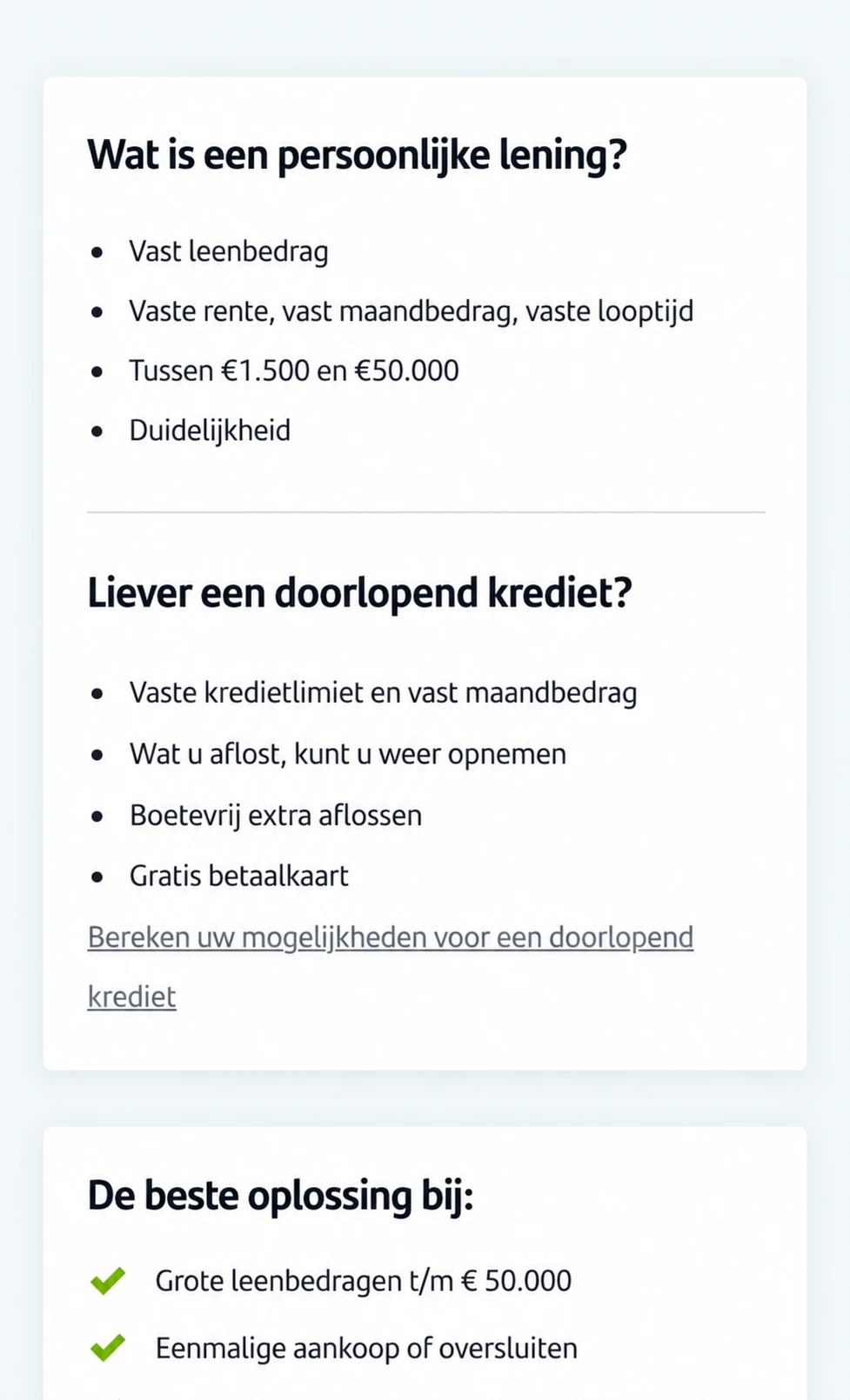
The homepage mentioned “Arranged in 3 steps” (=“In 3 stappen geregeld”) as a USP. However, the 3 steps and what are those steps aren’t mentioned throughout the website.
A/B testing experiments
Experiment hypothesis
Based on the research findings, it was hypothesised that by emphasising the loan purposes on the homepage and by adding the 3-step-process USP in the loan simulation page, clearer expectations would be set for the users.
These adjustments were intended to help offset the anticipated decline in loan applications since a product like revolving credit wouldn’t be offered anymore.
It was therefore hypothesised that the variants would present with either a flat or positive effect on the conversion rate of the loan applications.
Experiment #1
1
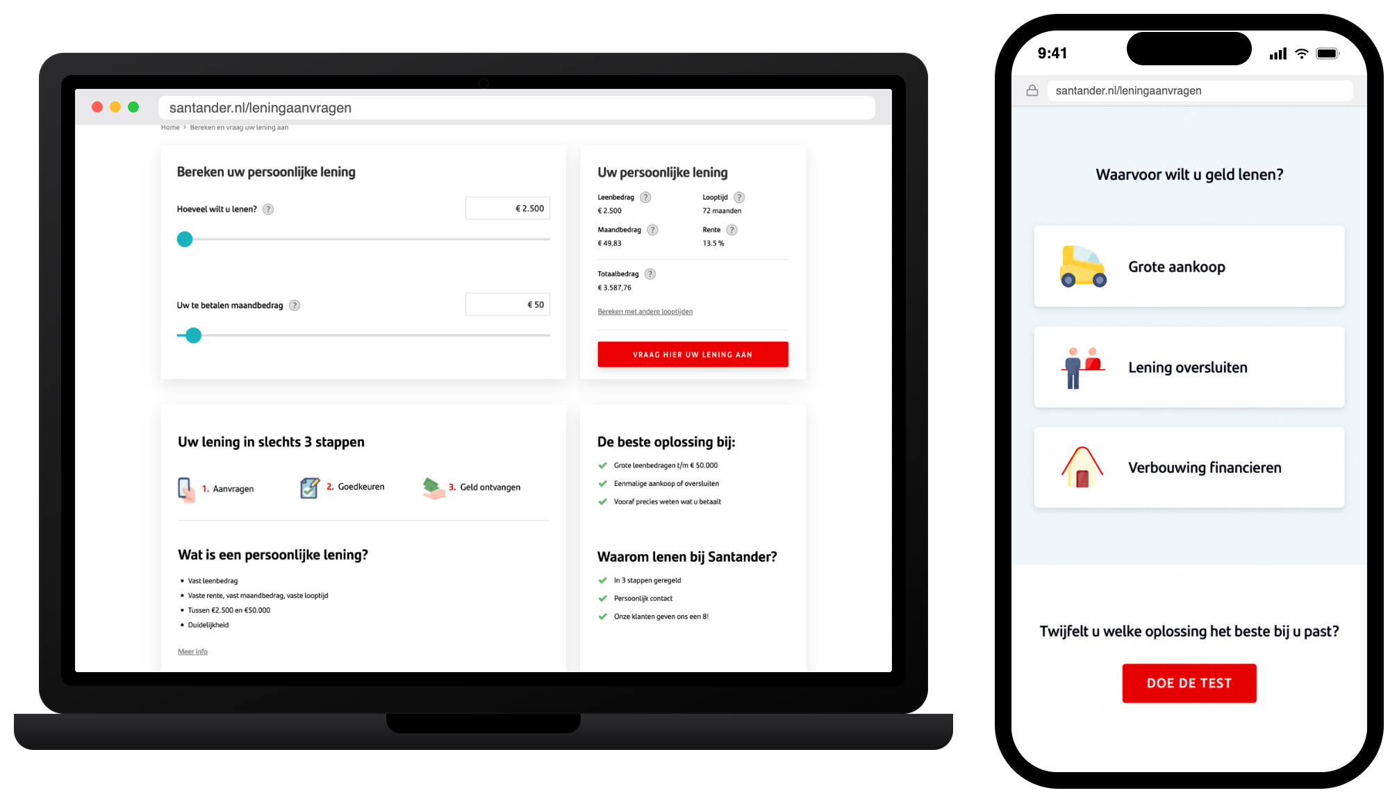
Product cards for personal loan and revolving credit were removed.
2
Only the loan purposes related to personal loan were kept but I changed the icons to fit with the most up-to-date icons of the brand that were available.
Before.
After.
Experiment #2
1
Revolving credit copy was removed.
2
Personal loan copy was positioned at the former position of revolving credit copy.
3
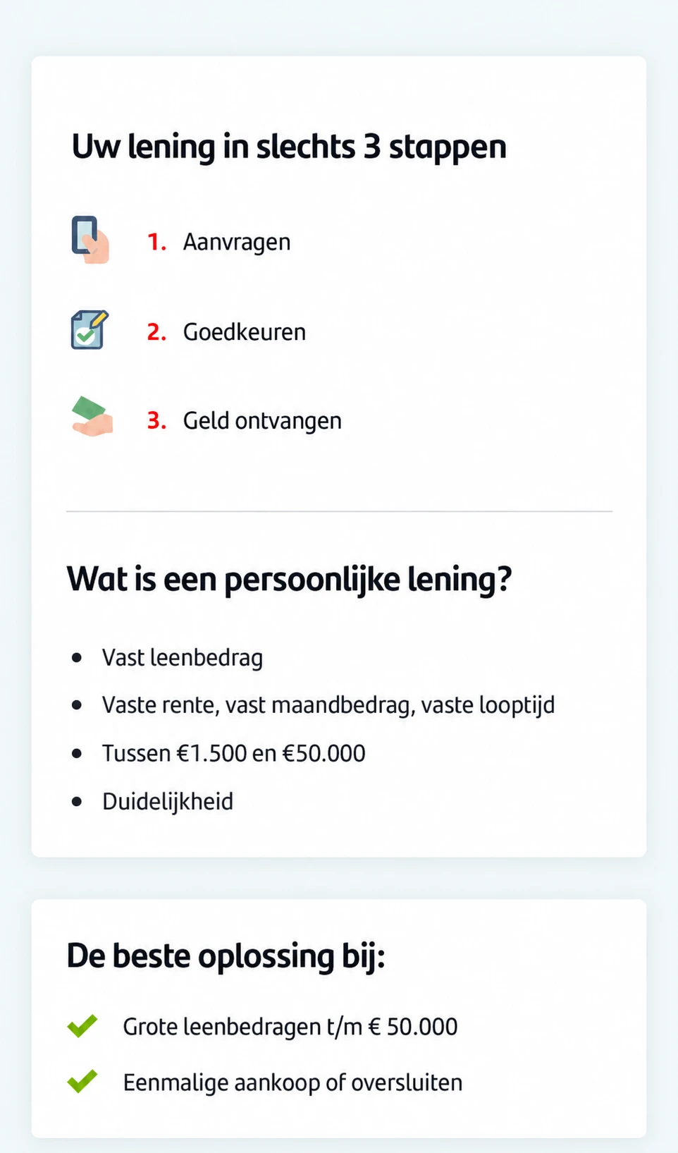
The 3-step USP and accompanying icons were placed at former position of personal loan.
4
A title for the USP section was added “Your loan in just 3 steps”.
Before.
After.
Results & impact
+3.9%
Conversion rate — a positive but not statistically significant trend, suggesting the removal of revolving credit reduced doubt and confusion between the two products rather than adding friction.
+€7.5M
Annual requested loan amounts — the projected increase, and the figure that greenlit the design solutions for full rollout.
Reflection
This project didn't start with a UX problem, it started with a regulatory one: a product was being switched off, and the business needed the rest of the funnel to absorb that loss without users noticing the gap.
The survey gave me just enough evidence to make two small, targeted changes rather than a redesign, which mattered because every change still needed sign-off and engineering time.
Sequencing the two experiments also meant that if something went wrong, I'd know exactly which change to undo, instead of guessing across several changes made at once.